
LUTs are a powerful tool that can completely change the look of any picture. This guide is geared towards generating LUTs for usage in ReShade.
Why would I want to use a LUT?
LUTs (Look-up Tables) are a cheap and simple way of changing the colours of your game without having to rely on a huge stack of shaders that eats at your performance. You can use them to make in-game colours look more natural (colour correction), or give your game a certain stylised look (colour grading).
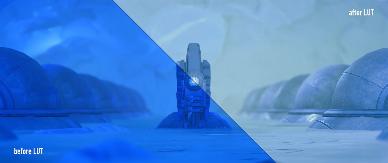 Mass Effect: Andromeda
How do I use a LUT?
You'll need one of these:
![]()
This texture is a LUT. More specifically, this is a neutral LUT. It does absolutely nothing, but is the starting point for everything you can do with LUTs.
This texture is incredibly important! It is the LUT itself, after all. Make sure you have it! You can either download the above texture, or it can be found in the standard reshade-shaders Textures folder as lut.png. Back it up somewhere, you'll want copies of this texture.
ReShade uses the shader LUT.fx to load and apply this. Note that LUT.fx only handles one (1) LUT, and I highly recommend this single LUT to be your colour correction LUT. You can have multiple LUTs and switch through them with the MultiLUT.fx shader.
How can I make one?
This guide covers the generation of LUTs using:
- ReShade
- Adobe Photoshop
- Adobe Lightroom
Additionally, it contains the usage guide for the MultiLUT.fx shader.
Navigate to these sections using the sidebar.
GIMP is not covered in this guide, as the old LUT guide still works.
ReShade
What you'll need:
- the game of your choice (with ReShade installed)
- the shader
qUINT_lightroom.fx - any ReShade shaders that change colours
I will be using ReShade 4.3.0. This guide assumes you are familiar with configuring ReShade.
Step 1: Setting up
qUINT_lightroom.fx is not part of the standard collection of shaders. Download it from the qUINT framework.
While qUINT Lightroom is perfectly capable of very extensive colour changes on its own, this guide will incorporate the effects of other colour grading/correcting shaders, such as FilmicPass.fx, LevelsPlus.fx, Technicolor.fx and so on into our LUT.
You would want to "bake" all these shaders into a single LUT because each shader has a small performance impact. These impacts, no matter how small, will add up over time. The impact of the LUT.fx shader on the other hand is much smaller, especially compared to other shaders, saving you your frames.
Additionally, having these LUTs around can preserve your presets in the odd event a future ReShade update causes shaders to malfunction.
Step 2: Configuring ReShade
We'll be taking advantage of qUINT Lightroom's ability to generate a LUT on-screen. The shader has to be at the top of your list, like so:
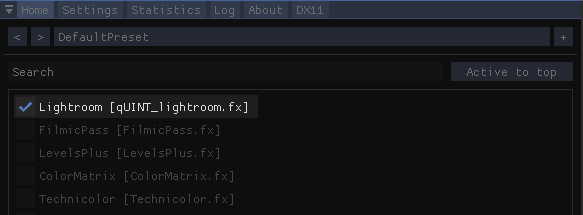
Having it at the top makes all shaders below it load on top of it, meaning their effects will be recorded onto the LUT.
Tick Enable LUT Overlay to generate the LUT, and change LUT tile size and LUT tile count both to 32.
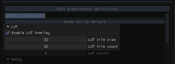
This is not a qUINT Lightroom guide, so we will not be covering how to use the rest of the shader. However, if you're experienced with it and have made changes you're happy with, continue to the next step.
With qUINT Lightroom all set up, we can move on to the magic. You can disable the shader or the LUT overlay if you don't want the LUT to be in your way while editing. Enable your favourite shaders and start messing around.
The shaders you want to use here must only change colours. Shaders that add bloom, grain, vignette, lens effects and/or any other visual effects (including depth shaders like AO and DoF) will only mess up your LUT.
Once you're happy with your results, we can move on to exporting.
Step 3: Exporting
The final step is to take a screenshot of your game, preferably using ReShade's built-in capture tool. The qUINT Lightroom-generated LUT has to be visible in this screenshot. If you've done everything right, the LUT should look different due to all the colour effects you've added.
Crop just the LUT out of that screenshot. You have to be precise with this crop, make sure it's pixel perfect. Save it as a PNG. Do not export it in a lossy format like JPG, you do not want compression artifacts in a LUT.
I would recommend exporting this file as lut.png, saving right into your Textures folder and replacing the previous lut.png that was in there. This makes it so you can use your LUT right away with LUT.fx.
Extra: LUT precision
Playing with LUT tile size and LUT tile count changes the precision of the LUT. This is typically unnecessary as a tile size and count of 32 is plenty precise. In the event that you have changed these values to be different than 32, LUT.fx has to be modified in order to display the LUT correctly. Skip to LUT variants and changing the atlas of the MultiLUT section at the bottom if you are modifying the shader.
Adobe Photoshop
What you'll need:
- at least one screenshot from your game
- Adobe Photoshop CS4 or newer (requires Adjustment Layers)
I will be using Photoshop CC 2019. The game screenshot is from GreedFall.
Step 0: Screenshot Collage
While not necessary, creating a collage of various screenshots will ensure that the effects of your LUT still look great in different scenes. They should cover various times of day and locations! This is important if you're making a corrective LUT.
Step 1: Adjustment Layers
With your screenshots loaded into Photoshop, it's time to get to work. I'll be focusing on colour grading the screenshot I have loaded. We'll be using Adjusment Layers here. Adjustment Layers are non-destructive ways to edit images and their effects can be copied to different documents.
Start by adding an Adjustment Layer from the Adjustments tab.
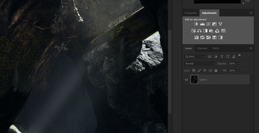
Use as many adjustment layers as you want! Don't hesitate to abuse them, as they all get baked down into a texture at the end. If you're going for style, go ahead and play with the weirder adjustments like Posterize, Threshold and Gradient Map. Try changing Blending Modes as well!
Once you've had your fun, you should have a few extra layers on your right.
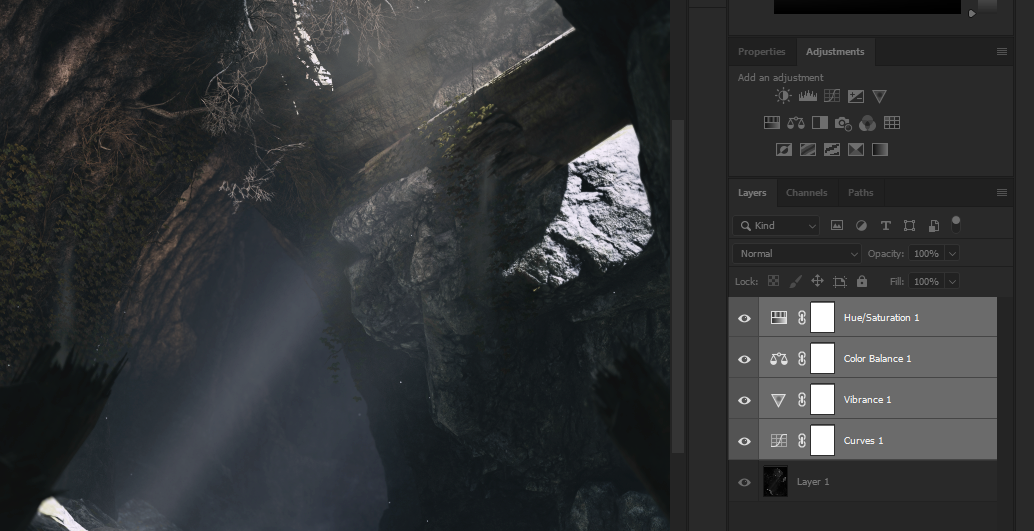 Curves for contrast, Vibrance for saturation, Color Balance for split-tones, H/S for selective colours (desaturated greens)
This is not a guide on editing images. If you'd like to learn how to use these adjustment layers, I recommend this guide by How-To Geek as a quick introduction to them.
You may have noticed the chain & white canvas next to your adjustment layer icons.
![]()
Ignore these. These are masks for the adjustment layers. Adjustment masking (for obvious reasons) will not transfer to your LUTs.
Step 2: The LUT
Next, you want to load in the neutral LUT texture from earlier as a separate document. Make sure that it's the neutral one. If not, you'll end up with really weird colours once you're done.
All you need to to here is copy the adjustment layers from your screenshot document to the new LUT document. This can be done by the traditional Ctrl+C / Ctrl-V, or you can select all adjustment layers, right-click, Duplicate Layers... and choose the LUT document.
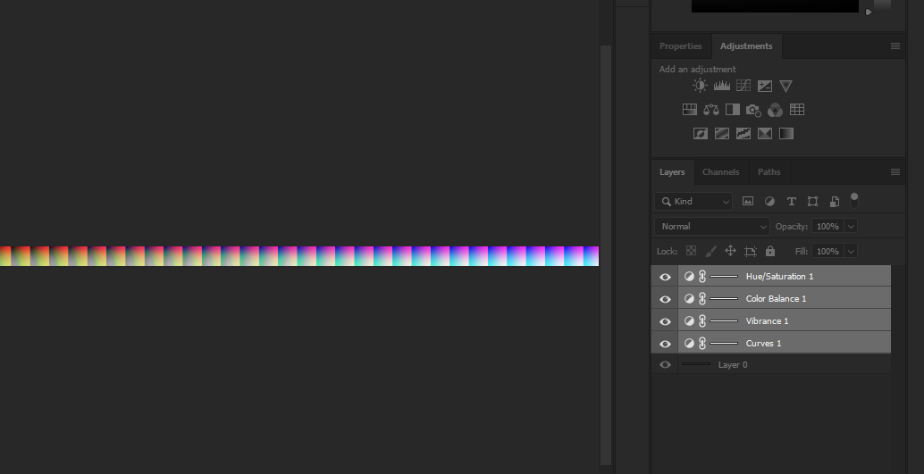
Depending on the extent of your adjustments, the LUT may look weird. My LUT shown above starts to look really off towards the left of the image, but that's because I desaturated the greens completely. If you've done everything right, there should be no worry here.
Step 3: Exporting
The final step is to export the image as a PNG. Do not export it in a lossy format like JPG, you do not want compression artifacts in a LUT. Unless you're going for a weird corrupted effect.
I would recommend exporting this file as lut.png, saving right into your Textures folder and replacing the previous lut.png that was in there. This makes it so you can use your LUT right away with LUT.fx.
Extra: .CUBE, .3DL and other 3DLUT formats
LUTs found online typically will be in the non-image file formats of .CUBE, .3DL, .CSP, .ICC, etc. They can be applied to a neutral LUT using the Color Lookup adjustment layer if you'd like to use them.
Adobe Lightroom
What you'll need:
- at least one screenshot from your game
- Adobe Lightroom (any version)
I will be using Lightroom CC 2019, not Lightroom Classic. Outside of a few UI differences, the overall steps are identical. The game screenshot is from Mass Effect: Andromeda.
Step 0: Screenshot Collage
While not necessary, creating a collage of various screenshots will ensure that the effects of your LUT still look great in different scenes. They should cover various times of day and locations! This is important if you're making a corrective LUT.
Step 1: Making the Preset
Import your screenshot(s) into Lightroom. If you've never used Lightroom before, don't worry, it's pretty straightforward. You have all your tools on the right (they'll be under Develop in Lightroom Classic), just play around with them and see what results you get!
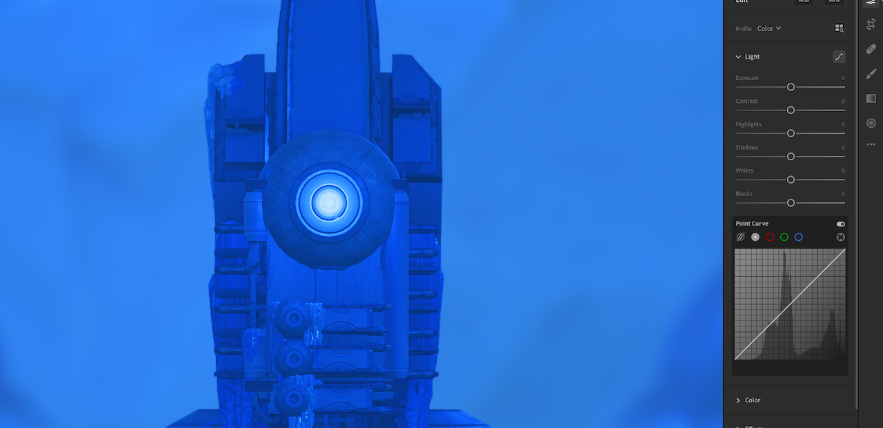
This is not a guide on editing images with Lightroom. There are plenty of guides out there on how to use Lightroom's features.
After a few minutes of messing around, this is my result.
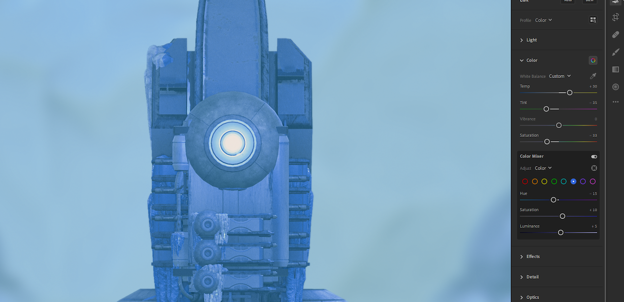
Once you're happy with yours, save it as a preset.
Do not include Texture, Clarity, Dehaze, Vignette, Grain, Sharpening, Noise Reduction and any lens corrections in your preset. This will completely ruin your LUT.
Step 2: The LUT
Import the neutral LUT texture from earlier. Make sure that it's the neutral one. If not, you'll end up with really weird colours once you're done.
Apply your saved preset to the neutral LUT.
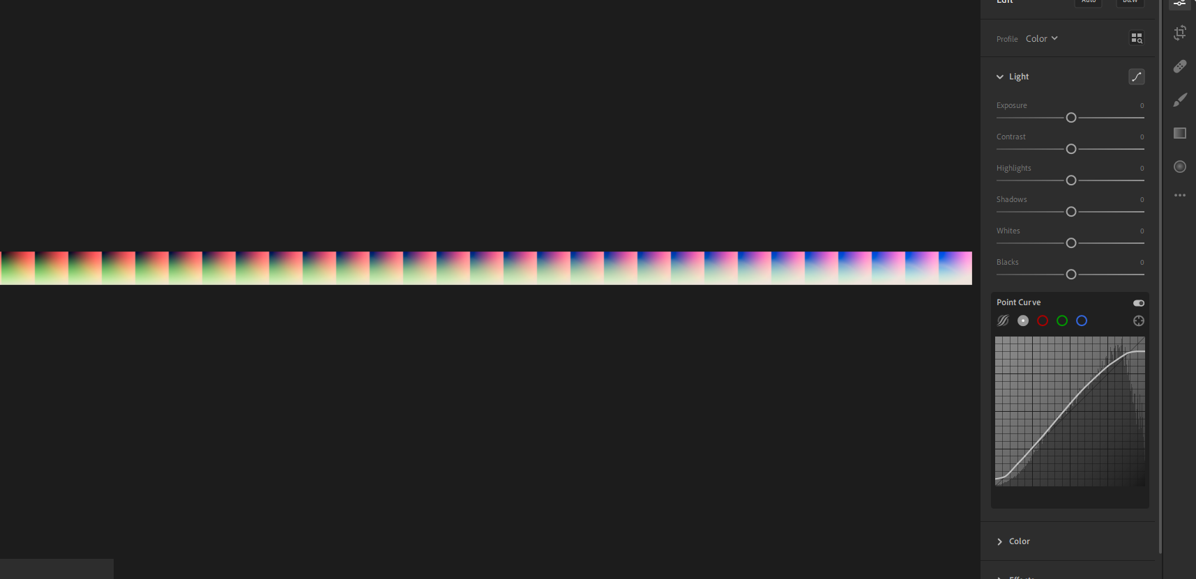
Depending on how much you modified your image, the LUT may look weird. My LUT shown above is quite washed out and overexposed, due to the extent of the changes I made to it. I'm not concerned though, as these changes were intended.
Step 3: Exporting
The final step is to export the image as a PNG. Do not export it in a lossy format like JPG, you do not want compression artifacts in a LUT. Unless you're going for a weird corrupted effect.
If you're not using Lightroom Classic, you have an additional step before you get to save as a PNG. You will need Photoshop for this. Under File, choose Edit in Photoshop.... This will automatically launch Photoshop with your LUT already loaded, ready to save. Export as PNG like you normally would.
I would recommend exporting this file as lut.png, saving right into your Textures folder and replacing the previous lut.png that was in there. This makes it so you can use your LUT right away with LUT.fx.
Extra: Lightroom presets
If you're an avid Lightroom user, chances are you already have presets made/downloaded. Just continue from Step 2 onwards, using the presets you have on hand.
MultiLUT
MultiLUT.fx is a shader that allows you to load in multiple LUTs and switch between them, as the name would imply. It does this by collecting the LUTs in an atlas.
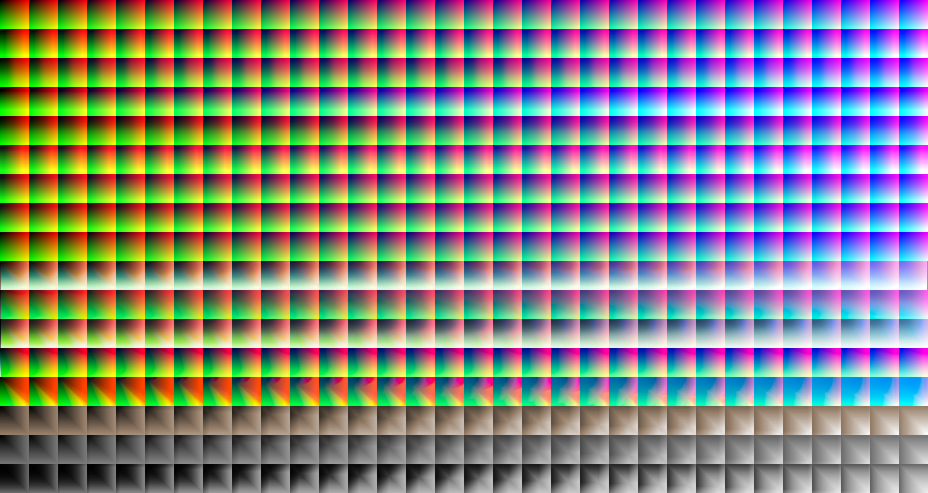
This is the default MultiLUT atlas. You're this far down in the guide, you should know what a LUT looks like, you should be able to tell that each row of this mess of boxes is a separate LUT.
You can use this shader as is, or you can modify it.
Modification is simple enough, just replace each row of LUTs with one of the many you've surely made by now. I would recommend keeping the top LUT as is; it's a neutral LUT.
Renaming the LUTs
You may not want your LUTs to be named Color 1, Color 2, Color 3 (Blue oriented) and so on, so this is how you can modify the shader file so that they're named the way you want.
Use the ReShade GUI whenever you are modifying a shader file (ReShade 4.0+, under the Statistics tab). With a key bound to reload ReShade, you can check what your modifications are doing on-the-fly. This is helpful to make sure your syntax is correct.
After opening the shader file, look for Line 31:
ui_items="Neutral\0Color1\0Color2\0Color3 (Blue oriented)\0Color4 (Hollywood)\0Color5\0Color6\0Color7\0Color8\0Cool light\0Flat & green\0Red lift matte\0Cross process\0Azure Red Dual Tone\0Sepia\0\B&W mid constrast\0\B&W high contrast\0";
This is the line we want to edit to give our LUTs custom names. \0 acts as the separator between the names, so don't remove that.
Let's say we added 4 of our own LUTs, replacing the second to fifth LUTs of that atlas (remember, first is neutral!). Now we want to give them names, I'll use the NATO alphabet for simplicity's sake: Alfa, Bravo, Charlie, Delta.
Line 31 should now look like this:
ui_items="Neutral\0Alfa\0Bravo\0Charlie\0Delta\0";
We've removed the excess names since we just want to use your LUTs. Don't worry, ReShade will ignore the excess names with no issue.
You can continue modifying the names to your own need. If you want to use quotes in your LUT names, don't use ". This ends the line and will cause errors. You'll want to use ' instead.
Adding more LUTs
The default atlas contains 17 LUTs, but if you have made more and would like to add them, the shader file once again needs to be modified to accommodate them. Once your atlas is fully compiled, you want to edit Line 20:
#define fLUT_LutAmount 17
Change 17 to the number of LUTs you now have. Remember to give them names so ReShade can find and load them.
LUT variants and changing the atlas
Sometimes you may come across LUTs that have more tiles or have a different tile size, such as those generated using qUINT Lightroom with modified tiles. Or you may have found a different MultiLUT atlas that you'd like to use.
#define fLUT_TextureName "MultiLut_Atlas.png"
Line 11 controls the name of the atlas file. If you have multiple atlases that you'd like to change to, just change the name of the PNG listed. Keep in mind that names obviously will not transfer.
#define fLUT_TileSizeXY 32
Line 14 controls the tile size, or the size of each box in a LUT. 32 refers to both width and height of each box, since they're squares. You may have to count pixels if the LUT you've found has a different tile size. (tip: use the height of your LUT, since height = width of each tile.)
#define fLUT_TileAmount 32
Line 17 controls how many tiles there are. This may differ if the LUT you found is meant to have higher precision (or lower). You will have to count the number of tiles (or divide width of the entire LUT by its height).
Extras
In the biased not-guide part of this guide, I'll be covering my general pros and cons to the three methods of LUT generation above.
| Subject | ReShade | Lightroom | Photoshop |
|---|---|---|---|
| Canvas | Dynamic! | Fixed shot :( | Fixed shot :( |
| Effect Types | Modular effects | Not modular :( | Modular & stackable! |
| Experience | Can be tedious :( | Fun and simple! | Can be tedious :( |
The :( aren't scores; I much prefer Lightroom over the rest despite how this looks. It's always about your personal preferences.
Modularity refers to how effects can affect each other. Since ReShade shaders can have different orders that change how they affect each other, I consider it modular. Photoshop comes out above that with how you can just keep adding more of the same adjustment layers if you want.
I find Lightroom better to work with than Photoshop overall, with dedicated controls for colour temperature and split toning (which aren't dedicated adjustment layers in PS for some reason).
On the old GIMP guide
I consider this entire guide to be an extension to the old one, covering more techniques you can use to generate LUTs. You can also use its method of adding the LUT directly to your screenshot, however I find a few drawbacks with that. You have the LUT constantly on-screen, you have to crop it afterwards, and you can't really quick-fire LUTs being made with presets. But that's just me. ¯\_(ツ)_/¯
Always keep in mind that visuals are subjective! There's never a right or wrong way to what your LUT should look like. All that matters is that it works for you.
last updated 12th October 2019
written by moyevka